Veev | Home Control Panel Redesign
SUMMARY
I worked on this project during my time at New Deal Design (2023).
Veev is a company that designs and runs Smart Homes in California. Their houses come equipped with touch screen control panels where homeowners can control lights, temperature, open and close garage door and more.
The current iteration of their home controls presents some challenges to the users and to the development team, and they looked to our team to reimagine the experience.
ROLE: Senior Experience Designer
DESIGN TEAM: Myself + Junior Experience Designer
SKILLS
UX Design
UI Design
Prototyping (Figma)
To define the key challenges and develop strategy to tackle the redesign, we spent time in one of the properties where we could experience the controls for an extended time.
Key Challenges
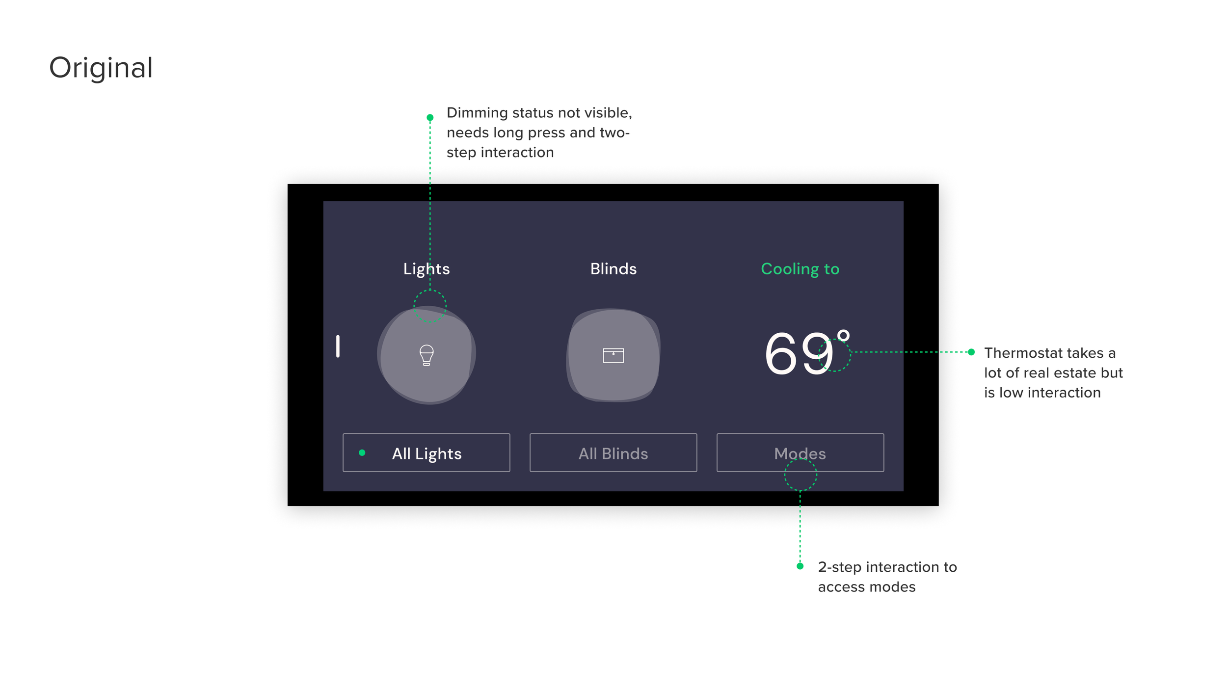
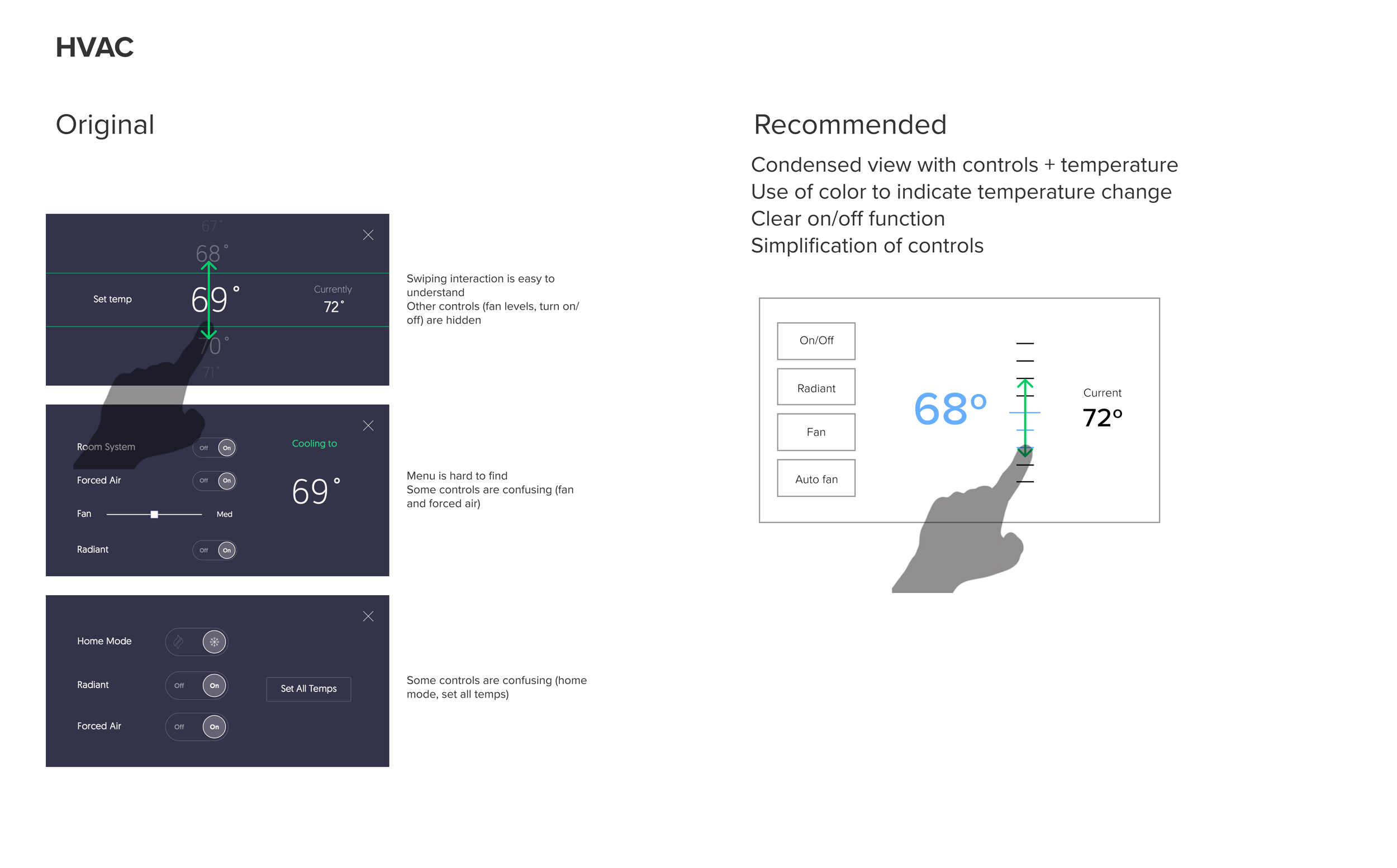
Can’t see status at a glance
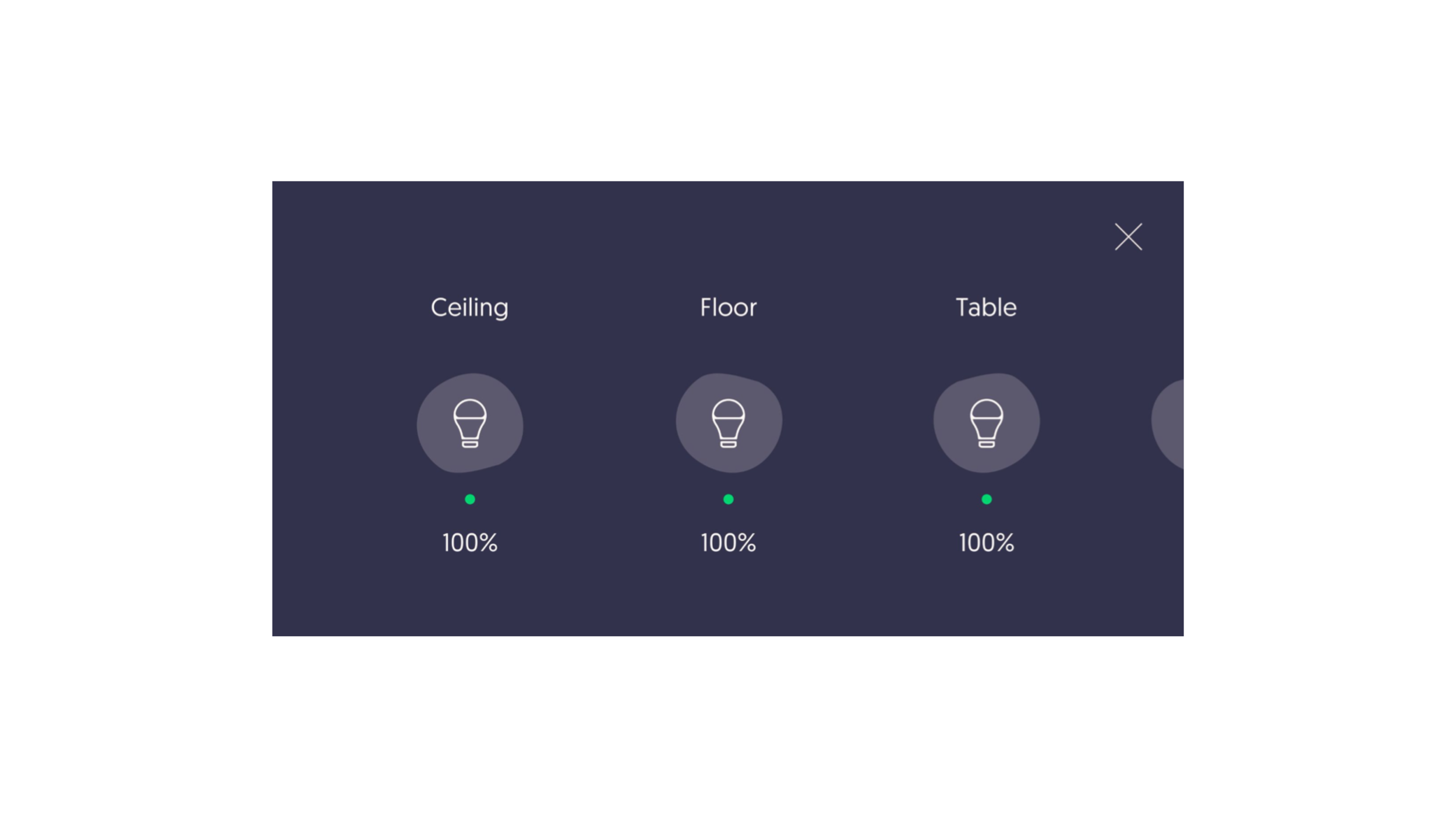
User can’t see at a glance the status of lights and blinds. They have to one by one activate each control to check status.
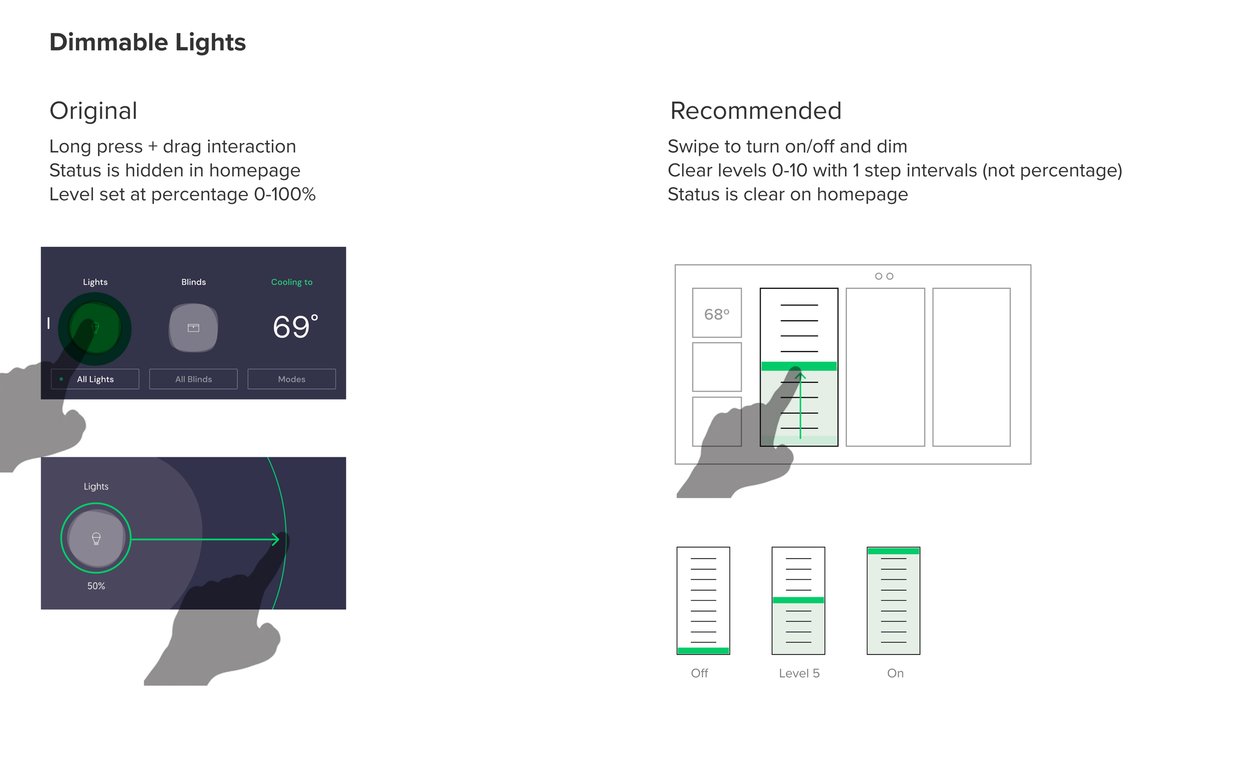
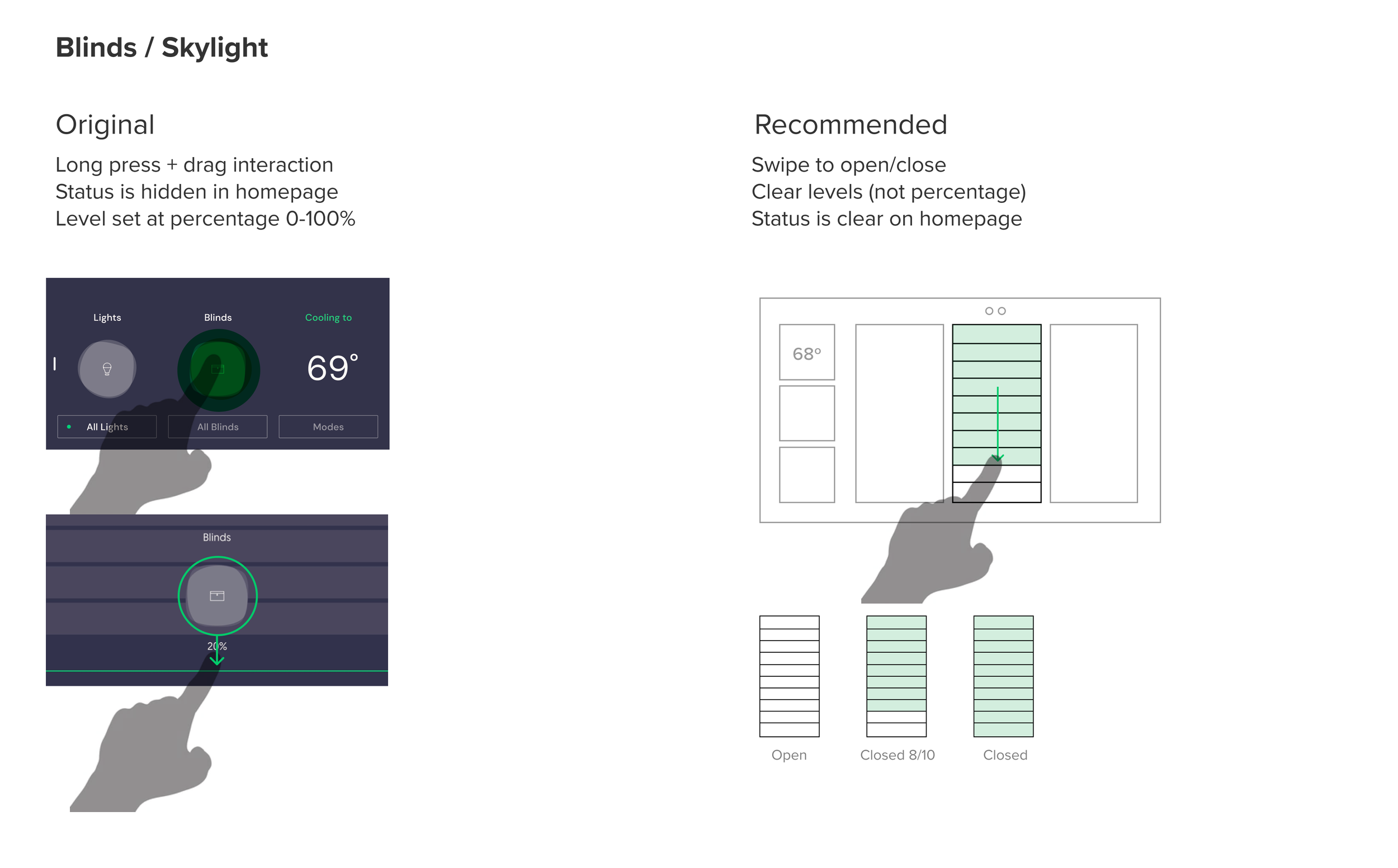
Unintuitive controls
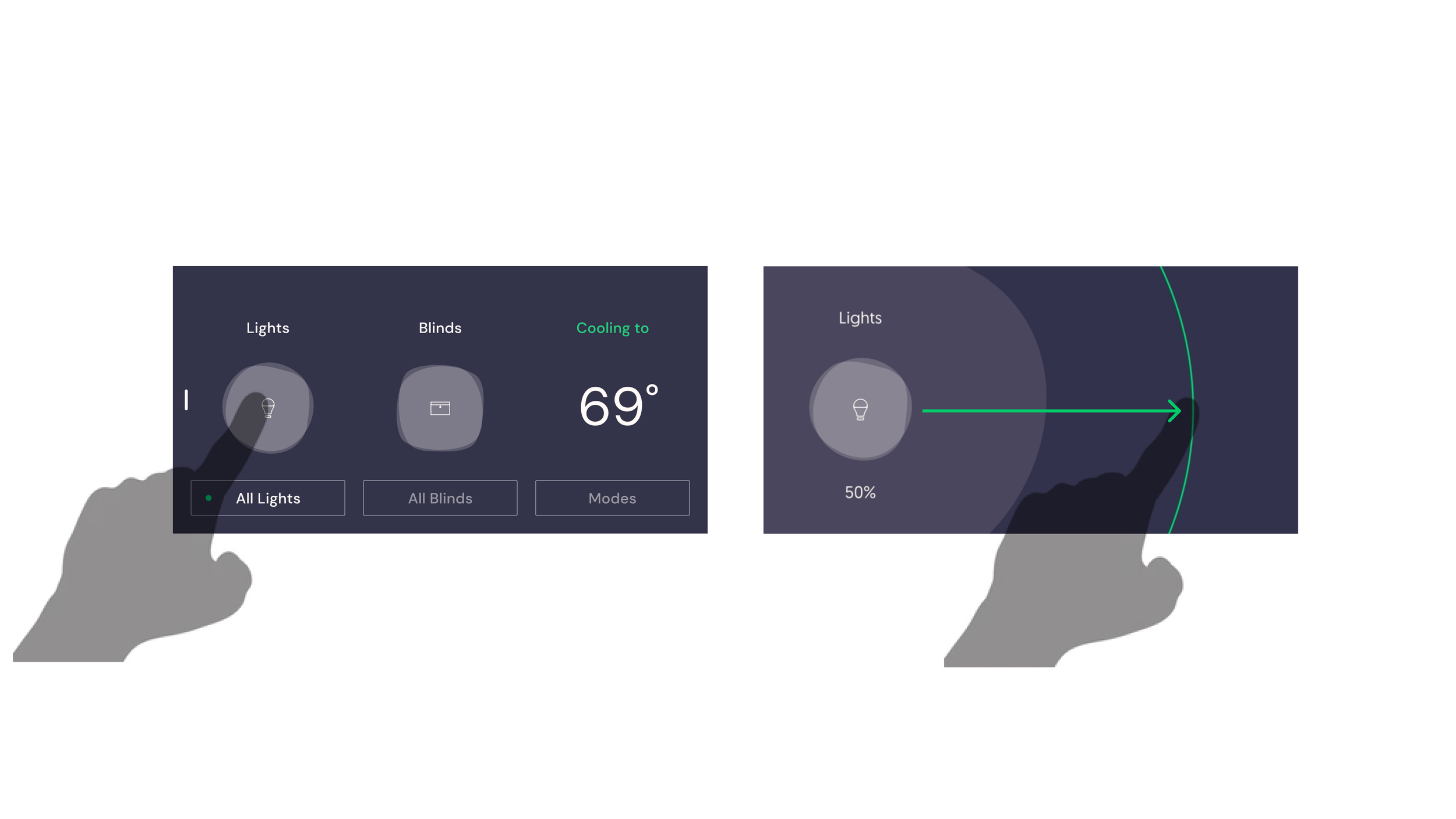
To access the control to dim lights and open a portion of the blinds, the user needs to long press and then drag the control. That feature is hardly ever discovered.
Access to correct control
Icons do not help clarify in which are the items are located, creating confusion. Finding the light to activate includes clicking and observing the room multiple times until intended one is found.
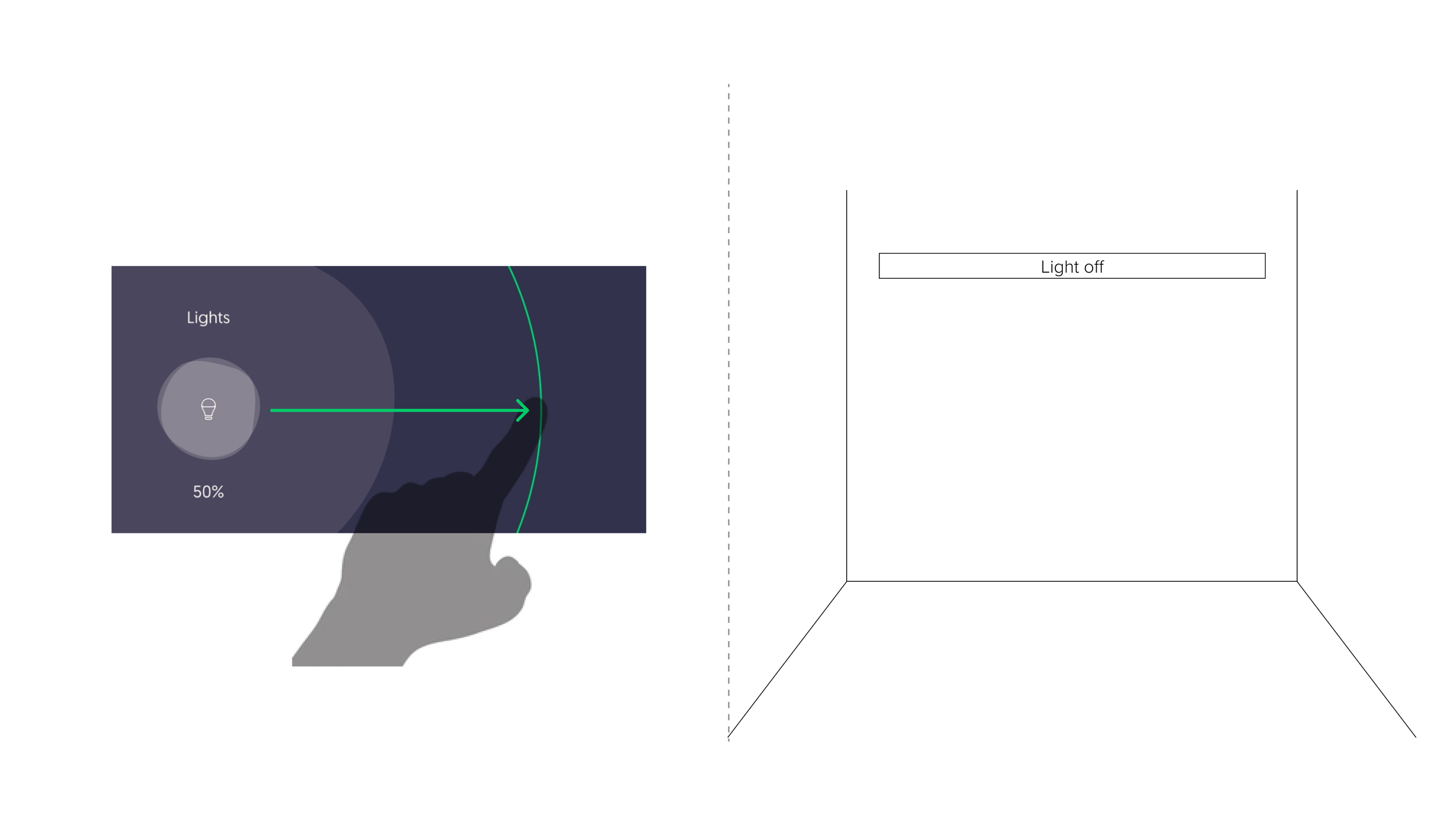
Lack of real time feedback
The percentage input creates a backlog in the system, so user has no real-time feedback of their controls, which was the initial intention for the user experience.
UX Strategy
We started by developing a new UX architecture for the home screen, and then reviewed each type of control.
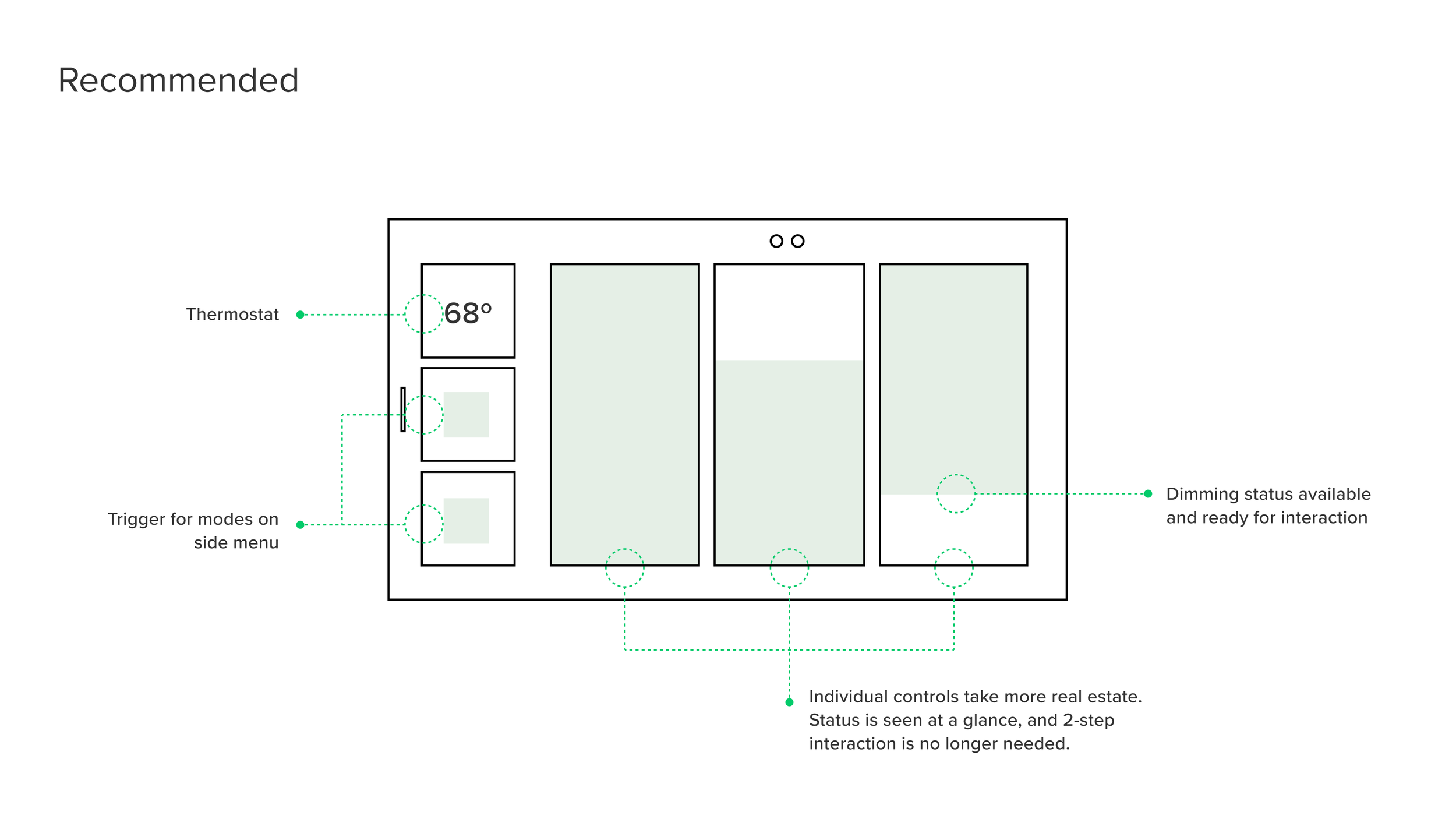
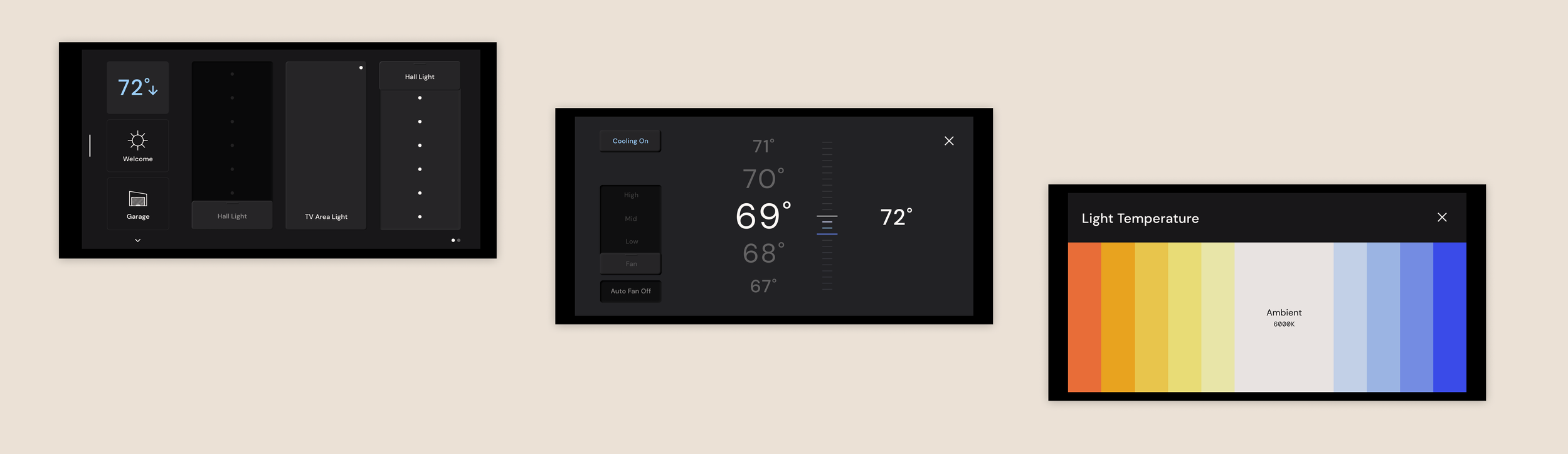
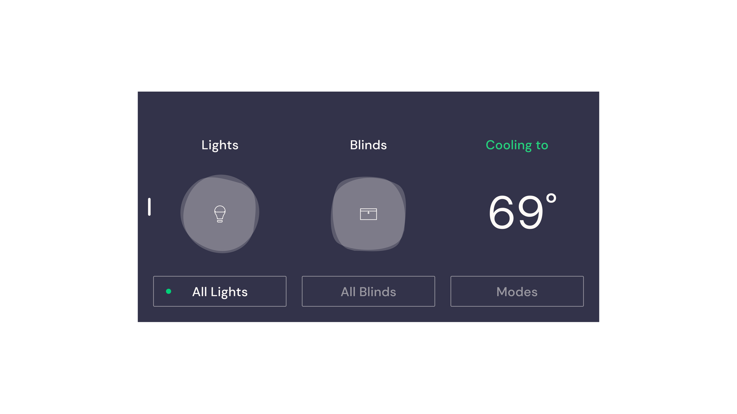
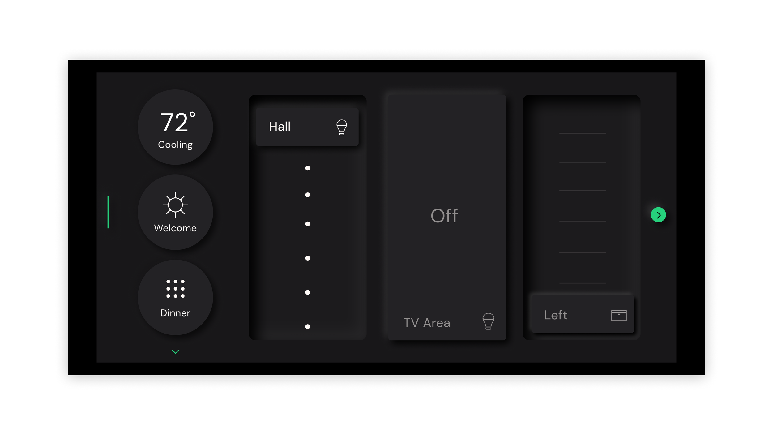
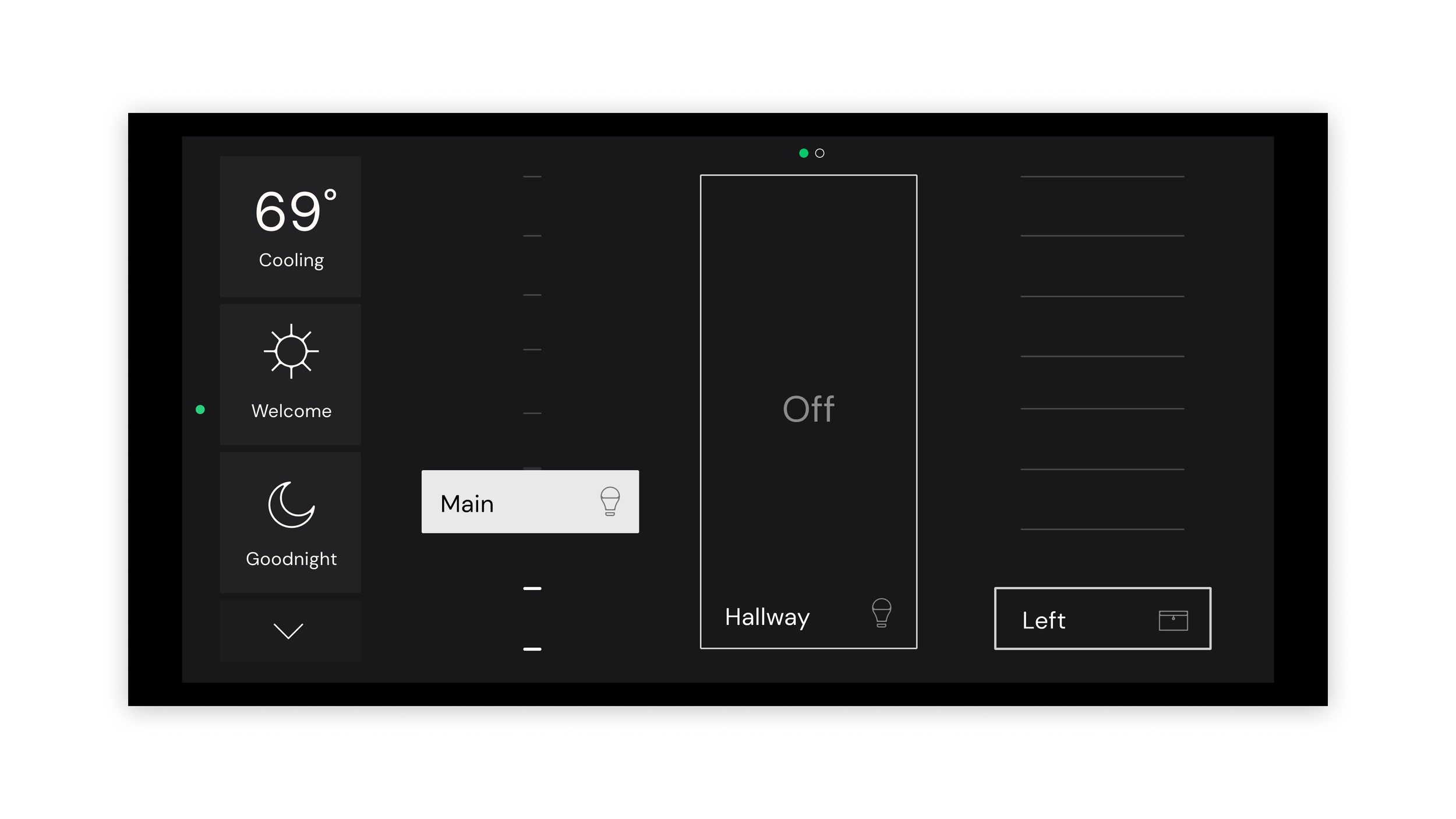
We restructured the hierarchy in the homepage:
We opted for deprioritizing the thermostat status, as this is not a high interaction control.
We separated what Veev calls “modes” from the individual controls, for clarity. Modes are a combination of controls that can be triggered both for lights and blinds, but not adjusted. This can cause confusion, therefore we recommended keeping them separate.
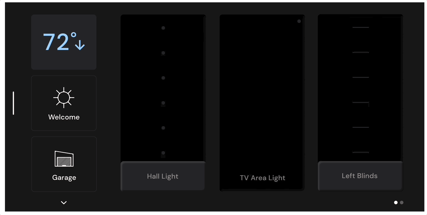
The controls take more real-estate on the homepage, with a clear show of status and with immediate possibility of interaction. This eliminates the need for the long press and the 2-step interaction. Even though this may cause more swiping depending on the number of controls in a room, it is still more clear than the long press interaction.
Individual Controls Architecture
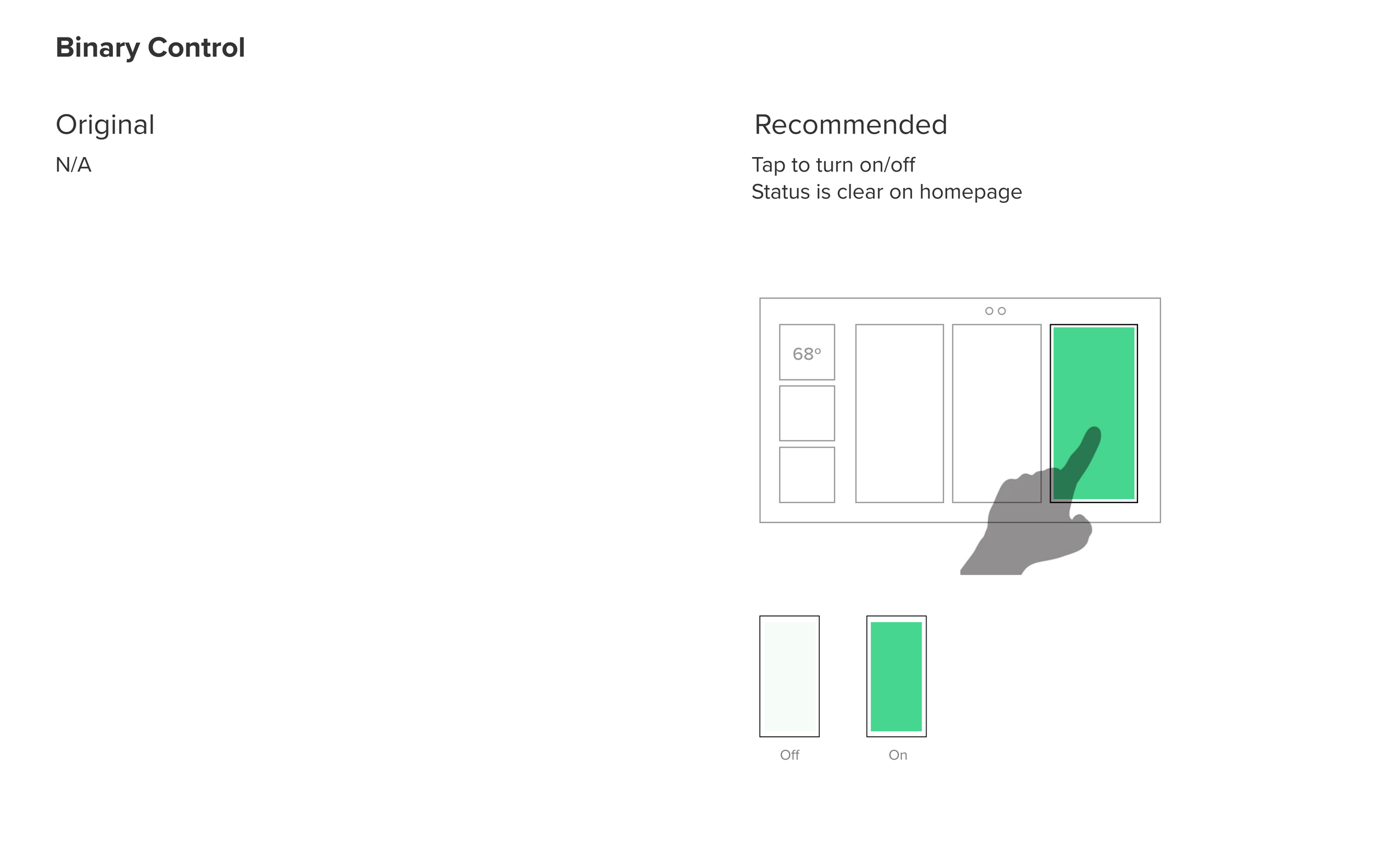
Each type of control (Lights, Blinds and Skylight and Binary) have different requirements, which we were able to establish after individual analysis.
UI Redesign
To implement the UX architecture changes, we also developed a refreshed UI experience for the smart home control panels.
Visual Design Directions
We presented three directions for the first round of visual design. I was responsible for the two directions pictured here.
Overall we recommended changing the color palette toward a darker version that would create less contrast with the screen frame, which was black. We minimized the use of icons, especially in the light and blinds controls, using instead the area where the device is to call it out. We purposefully designed visually different controls for each device because it can more easily communicate what kind of device it controls, instead of relying on icons and words.
Neumorphic
This direction leverages shading to convey volume in the 2D screen. This was an interesting contender for Veev because at this time they had a project to replace the digital smart home controls with physical ones, so they could use the visual design to bridge the gap of this transition.
Piano
This direction leverages minimal line design to convey controls, which would be a good contender for Veev because it would remain relevant for quite some time.
Visual Design Refinement
The Veev team decided to move forward with Neumorphic, and after receiving feedback, we refined this direction.
We decided the icons were actually not adding value to the design, so we completely removed icons from lights and blind controls. Besides that, we refined shapes to make the volumetric perception on Neumorphic more subtle. We suggested using the green brand color more sparingly, and leverage the use of color specifically to convey temperature control changes (cooling and heating).